Pulse of Information
Your source for the latest insights and updates.
Type This: Crafting Web Typography That Speaks Volumes
Transform your website's voice with stunning typography tips that captivate and engage! Discover secrets that speak volumes!
The Psychology of Fonts: How Typography Influences User Perception
Typography plays a crucial role in shaping user perception on digital platforms. The choice of font can evoke specific emotions and influence how content is received. For instance, a serif font like Times New Roman may convey a sense of tradition and reliability, making it suitable for formal documents, while a sans-serif font like Arial communicates a modern and clean aesthetic, often favored in tech-related content. Understanding the psychological impact of different typefaces can help designers and marketers craft messages that resonate with their target audience.
Moreover, the readability and legibility of a font significantly affect the user's ability to absorb information. Fonts that are too decorative may distract the reader, leading to disengagement, whereas straightforward fonts enhance comprehension. Research shows that users tend to retain information better when it is presented in a clear and approachable typeface. Therefore, selecting the right typography is not just a matter of visual appeal but a strategic decision that can optimize the user's overall experience and perception of the brand.

10 Essential Typography Tips for Stunning Web Design
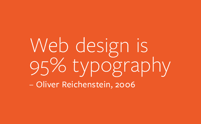
Typography plays a critical role in web design, as it influences both aesthetics and readability. Here are 10 essential typography tips that can elevate your website's design:
- Choose the Right Font Pairing: Use contrasting fonts for headings and body text to create visual hierarchy.
- Limit Your Font Choices: Stick to two or three fonts to maintain consistency and avoid overwhelming your users.
- Pay Attention to Size: Ensure that your text is large enough to be easily readable on all devices, but not so large that it overshadows your design.
- Use White Space Effectively: Adequate spacing between letters, lines, and paragraphs enhances readability and gives your design room to breathe.
It's important to also consider how typography impacts user experience. For instance, contrast between text and background can significantly affect readability. Opt for high-contrast combinations, such as dark text on a light background, to ensure your content is accessible to everyone. Additionally, consider your audience's preferences; using responsive typography techniques can enhance the viewing experience on any device. Lastly, always prioritize the importance of keyword optimization within your typography to help improve your site's SEO. Remember, a well-typographed site not only looks good but also retains visitors and enhances engagement.
What Makes Typography Effective in Communicating Your Brand?
Typography plays a crucial role in shaping how your audience perceives your brand. The right typeface can evoke emotions and set the tone, making it essential to select fonts that align with your brand’s personality and values. For instance, a tech company may opt for a modern sans-serif typeface to convey innovation and clarity, while a luxury brand might choose an elegant serif that communicates sophistication and tradition. Understanding the psychology of fonts and their effectiveness in brand communication enables you to create a strong visual identity that resonates with your target audience.
Moreover, effective typography goes beyond choosing the right typeface; it involves careful consideration of typographic hierarchy, spacing, and alignment. By organizing content through various font sizes and weights, you can guide readers through the information, highlighting key messages while ensuring readability. Consistency in typographic choices across platforms and marketing materials enhances brand recognition, making your communication more impactful. Ultimately, when used thoughtfully, typography becomes a powerful tool that not only conveys your message but also strengthens your overall brand identity.