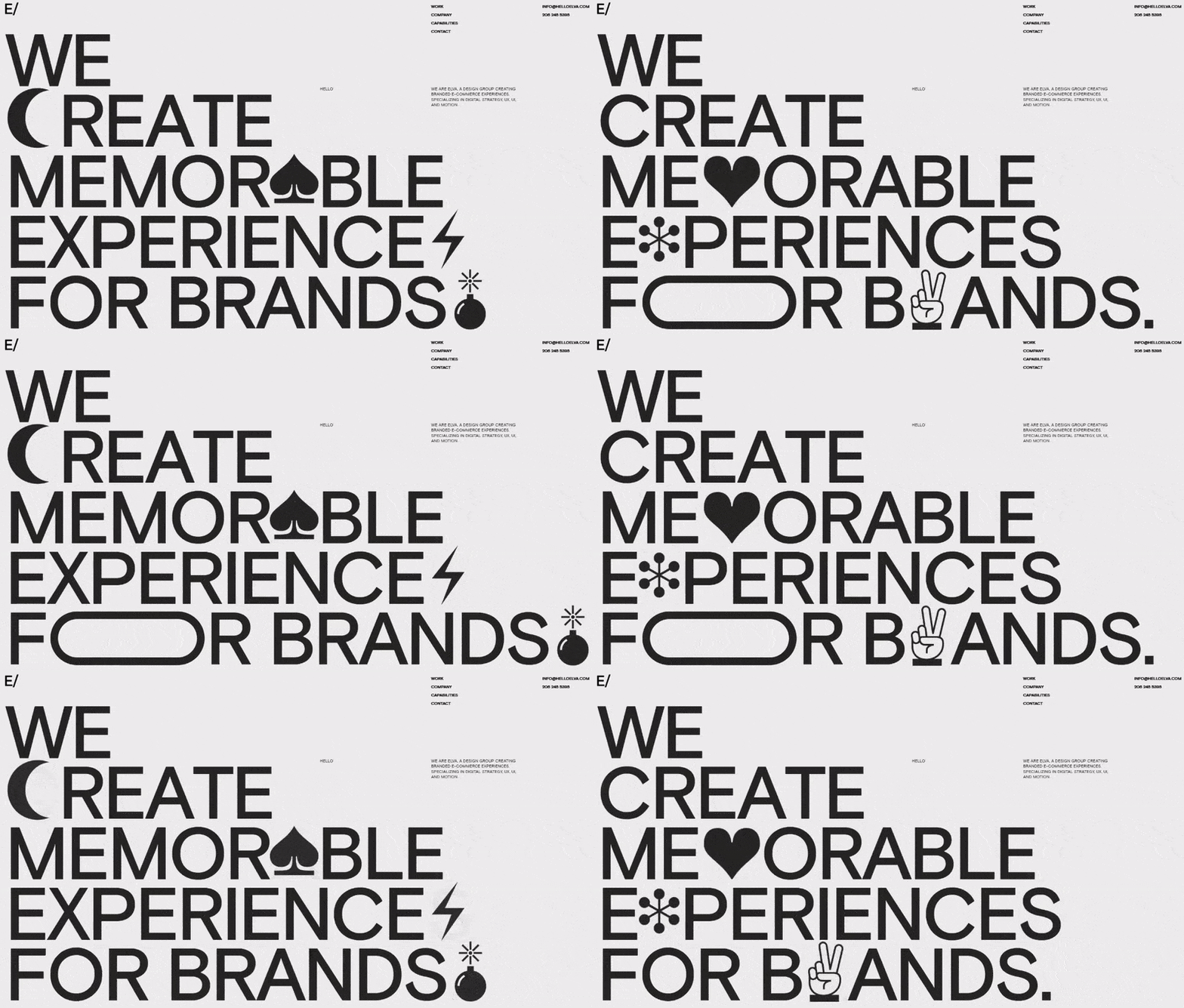
Pulse of Information
Your source for the latest insights and updates.
Type in Style: Web Typography That Speaks Volumes
Unlock the secrets of captivating web typography that enhances your brand’s voice and boosts engagement. Discover what your fonts can say!
The Ultimate Guide to Choosing the Right Font for Your Website
Choosing the right font for your website is crucial to not only enhance its aesthetic appeal but also improve user experience and readability. A well-chosen font can create a strong brand identity and communicate your message effectively. Consider factors such as font style, legibility, and compatibility with your overall design. Furthermore, it’s essential to match the font to your content's tone, whether it be professional, playful, or creative. Utilizing a combination of fonts can also help distinguish headings from body text, but ensure that the fonts complement each other rather than clash.
When selecting a font, you should also think about your audience. Different demographics may respond differently to various font styles. For example, younger audiences might prefer modern, sans-serif fonts that give a clean and contemporary feel, while older audiences might favor traditional serif fonts that feel more familiar. Additionally, performance matters: fonts displayed in web-safe formats can ensure faster loading times, which is essential for maintaining site traffic. To help you organize your thoughts, consider making a list of criteria such as readability, load speed, and brand alignment before finalizing your choice.

10 Common Typography Mistakes and How to Avoid Them
Typography plays a pivotal role in the overall user experience of your blog, making it essential to get it right. One of the common typography mistakes is choosing the wrong font pairing, which can create visual chaos. To avoid this, select complimentary fonts that enhance readability. For instance, pairing a serif font for headings with a sans-serif font for body text is a proven technique. Additionally, be mindful of font sizes: using a font size that is too small can strain the reader's eyes. Aim for a minimum of 16px for body text to ensure clarity.
Another frequent typography mistake is neglecting line spacing and letter spacing, which can hinder readability. In general, a line height of 1.5 times the font size is recommended for body text. In terms of letter spacing, avoid cramming too much text together; a little extra space can lead to a more inviting read. Moreover, be careful with text colors and ensure they provide sufficient contrast against the background to meet accessibility standards. By paying attention to these details, you can elevate your typography and create a visually appealing blog that keeps your readers engaged.
How Web Typography Influences User Experience and Conversion Rates
Web typography plays a pivotal role in shaping the overall user experience (UX) on websites. The choice of typeface, font size, line spacing, and color can significantly affect the readability of the content. For instance, employing sans-serif fonts for body text often results in better legibility on screens, while properly spaced lines can prevent users from feeling overwhelmed by blocks of text. When typography is carefully considered, it guides users through the content seamlessly, enhancing their interaction with the site. A positive UX not only retains visitors but also encourages them to explore further, thus increasing engagement rates.
Moreover, effective web typography is instrumental in boosting conversion rates. A well-structured layout with attractive headlines draws users in, creating a stronger initial impact. By utilizing compelling call-to-action (CTA) buttons styled with recognizable fonts, businesses can significantly improve their chances of conversions. It's essential to maintain consistency in typography throughout the website, as this instills trust and professionalism in the eyes of the user. In essence, when typography aligns with brand messaging and user needs, it can lead to higher conversions by encouraging users to take desired actions.