Pulse of Information
Your source for the latest insights and updates.
Typefaces That Speak Louder Than Words
Discover typefaces that convey powerful messages and elevate your designs—transform your words into visual art!
The Psychology of Typefaces: How Font Choices Affect Perception
The choice of typeface is a powerful element in design that significantly impacts how information is perceived by the audience. Different fonts evoke different emotions and associations; for instance, a serif typeface like Times New Roman often conveys a sense of tradition and reliability, while a sans-serif typeface such as Arial is perceived as modern and clean. Research shows that these choices can affect readability, brand perception, and even consumer behavior. When businesses align their font choices with their brand identity, they can enhance their message and connect more deeply with their target audience.
Moreover, the psychology of typefaces extends to how individuals respond to various fonts in marketing and advertising. Studies indicate that using more rounded fonts can create a sense of warmth and friendliness, whereas angular fonts can evoke feelings of strength and professionalism. This phenomenon emphasizes the importance of understanding audience demographics; for example, younger consumers might be more drawn to quirky, unconventional fonts, while older audiences might prefer classic, easily readable options. Therefore, selecting the right typeface not only enhances aesthetic appeal but also plays a critical role in effectively communicating the intended message.

10 Iconic Typefaces That Define Brand Identity
Typography plays a crucial role in shaping brand identity, and certain typefaces have become iconic for their ability to convey personality and values. Here are 10 iconic typefaces that have left an indelible mark on the branding landscape:
- Helvetica: Known for its clean and modern aesthetic, Helvetica has been the choice of numerous global brands, signifying simplicity and efficiency.
- Garamond: This classic serif typeface exudes elegance and tradition, making it suitable for brands that want to portray sophistication.
- Futura: With its geometric shapes and forward-thinking design, Futura is often used by brands wanting to project a sense of innovation.
- Times New Roman: As one of the most recognized typefaces in digital media, it communicates reliability and professionalism.
- Verdana: Designed specifically for on-screen readability, Verdana emphasizes accessibility, making it popular among tech-savvy brands.
- Impact: This bold typeface is often used in advertising to grab attention and convey urgency.
- Bodoni: With its high contrast and stylish look, Bodoni appeals to luxury brands wanting to make a statement.
- Georgia: Another web-friendly serif typeface, Georgia balances screen clarity with traditional elegance.
- Rockwell: This slab serif font reflects strength and reliability, making it suitable for construction and industrial brands.
- Comic Sans: Despite its controversial reputation, Comic Sans has been adopted by various non-traditional brands for its playful and informal feel.
Choosing the Right Typeface: What You Need to Know
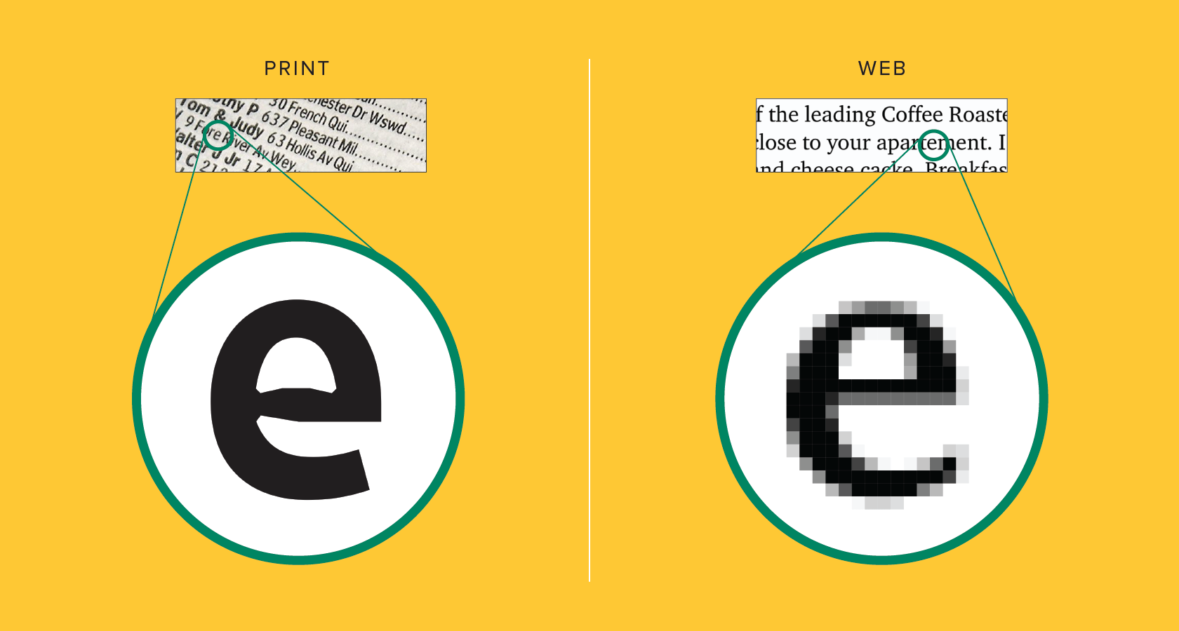
When it comes to choosing the right typeface, several factors should be taken into account to ensure that your content is not just visually appealing but also effective for communication. First, consider the tone of your content. A serif typeface may convey a sense of tradition and reliability, making it suitable for academic or formal writing, while a sans-serif typeface can offer a modern and clean aesthetic, ideal for tech blogs or casual sites. Additionally, readability is paramount; your typeface should be easy to read across different devices and screen sizes. Always test your choices with real users to gauge their response.
Another crucial aspect of choosing the right typeface is understanding the impact of font pairing. Combining two complementary typefaces can enhance visual interest while maintaining coherence. For instance, using a bold display typeface for headings and a simpler body typeface can create a nice contrast that guides the reader’s focus. Keep in mind that limiting your typeface choices to two or three will help maintain a clean layout without overwhelming your audience. Additionally, it’s essential to consider accessibility; always ensure that your font choices accommodate diverse audiences, including those with visual impairments.